This is a continuation of
part 1, where Itten's Laws of Form were discussed. In this post we present Itten's basic contrasts.
To the complaint, ’There are no people in these photographs,’ I respond, ’There are always two people: the photographer and the viewer. — Ansel Adams, (1902 - 1984)
The basic references used here are
- M. Freeman, The Photographer’s Eye, Focal Press, 2007. (Note: The latest 2019 edition has no mention of Itten in the index, but the original 2007 version does.)
- J. Itten, Mein Vorkurs am Bauhaus. Gestaltungs und Formelehre, Otto Maier Verlag, Ravensburg (1963). Translated as Design and Form: The Basic Course at the Bauhaus, Thames and Hudson, London (1964).
Also, Steven Bradley has written a terrific
series of blog posts on design elements.
Basic Contrasts
- Open vs Closed - A closed composition is a static image which contains all the elements inside the frame. For example, the monochrome shot of a lamp and shadows cast.
An open composition is an image that contains elements that run off towards the edges and seemingly beyond. It could involve dynamic movement (out of the frame) or leading lines (out of frame), or even shadows and/or reflections suggesting a subject out of frame.
The hi-key example above has tree branched leading out of frame to the tree itself. It's shot against a building (the Baltimore Museum of Art, whose exterior is tiled with rectangular metal panels). Another open composition is the shot of the skateboarder's shadow shown above.
- Point vs Line - These two design elements must both occur predominantly in frame. The shape of the line can suggest a mood - for example, straight lines can appear calm, while jagged lines can suggest nervousness or anger. Lines can also be used to lead the eye through the image. A point, on the other hand, is asking for some kind of relationship with other elements of the image. Our brain is compelled to connect parts, to describe the point as part of something else.
For example, in the following minimalist composition we see a thick line, giving some texture, along with a point (the flying bird towards who knows what). Our brain tells us the bird is heading towards the line.
See also Points vs Line below.
- Diagonal vs Circular - These are less compositional elements than styles. The diagonal line is the communicates dynamic energy. (For instance, the floors of a building shot at an angle creates diagonal lines resulting in a dynamic, open composition.) On the other hand, objects arranged in a circular composition within an image gives the viewer a sense of organization and unity. This is more typically a closed composition.
It's unusual to run across an image that contains both but here is one:
(A long exposure taken while driving through an arc over the road which was strung with Xmas lights. Not recommended to try at home.) The diagonals are formed by the individual light rays and the circles are formed by the shape these rays are arranged in the image. Another example:
Arguably, this has both diagonal (the arms) and circular elements (the arrangements of them), but to me this is more of a closed, circular composition.
An example of purely diagonal style is the Peabody Library image above.
For examples of some circular compositions:
(Here, I've arranged the collage of images in a circular manner around the face of a model.) Another example:
(Looking straight up in the Levy Center at the USNA.)
For an interesting discussion of the pyschology of the circular composition, see this online article, part of John Suler's book Photographic Psychology: Image and Psyche.
- Straight vs Curved - Lines are design elements which commonly arise in photographic compositions. Here's a simple example of a reflection in a fountain with both elements.
Here are two images (both from buildings in Rosslyn, VA), one entirely composed of curved lines, the other entirely composed of straight lines:
- Rough vs Smooth - This is a contrast of textures (more precisely, of perceived physical textures) of objects in the photograph. In design, rough surfaces suggest visual activity, while smooth surfaces are more relaxing.
Each of the images have both rough areas and smooth areas. Here are examples of each:
- Points vs area or Points vs Line - These design elements must occur predominantly in the image.
The image in the Simplicity Law of Form in part 1 of this post is an example of Point vs Area.
- Many vs Few (or Much vs Little) - This creates a contrast which can potentially draw the eye's attention to one (the "many") or the other (the "new").
- Area vs Volume -- An area, eg a surface or planar contour, has a visual "weight" determined by its size and complexity.
Simple shapes (eg, geometric shapes, like circles and squares) typically have more weight than complex ones (eg, a maple tree leaf). Volumes have greater visual weight than areas or surfaces and can create interesting visual contrasts of forms.
- Lines vs Volume - Lines connect, unite, they lead somewhere. Lines suggest movement and direction. Perspective lines can help create the illusion of volume. Another way to create this 3-dimensional illusion to change the color value across a 2-dimensional object in an image, simulating the effect of light and shadow on a surface. Thus giving this 2-dimensional object has the illusion of being 3-dimensional.
And I'm sorry but I can't avoid this visual pun (volumes = books:-).
- Big vs Small - Contrasts provided by size, scale, or proportion. By size, we mean the physical dimensions of the object in the image. By scale, we mean the relative sizes of different objects in the image. By proportion, we mean scaling suggesting distance.
The first image below is a contrast in size, while the second is a contrast in proportion.
- Hard vs Soft - This could be taken literally or could mean "sharp vs blurred" or "solid vs liquid". All are examples of contrast, each with their own use. For example, sharp focus and soft focus create a sensation of depth.
And one more for the sake of photographic humor:
There are lots of other contrasts, for example:
| point |
vs |
line |
| high |
vs |
low |
| light |
vs |
heavy |
Go forth and experiment!
 The hi-key example above has tree branched leading out of frame to the tree itself. It's shot against a building (the Baltimore Museum of Art, whose exterior is tiled with rectangular metal panels). Another open composition is the shot of the skateboarder's shadow shown above.

 See also Points vs Line below.
 Arguably, this has both diagonal (the arms) and circular elements (the arrangements of them), but to me this is more of a closed, circular composition. An example of purely diagonal style is the Peabody Library image above. For examples of some circular compositions:
 (Here, I've arranged the collage of images in a circular manner around the face of a model.) Another example:
 (Looking straight up in the Levy Center at the USNA.)
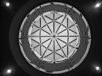


 Each of the images have both rough areas and smooth areas. Here are examples of each:


 The image in the Simplicity Law of Form in part 1 of this post is an example of Point vs Area.


 And I'm sorry but I can't avoid this visual pun (volumes = books:-).


 And one more for the sake of photographic humor:


No comments:
Post a Comment